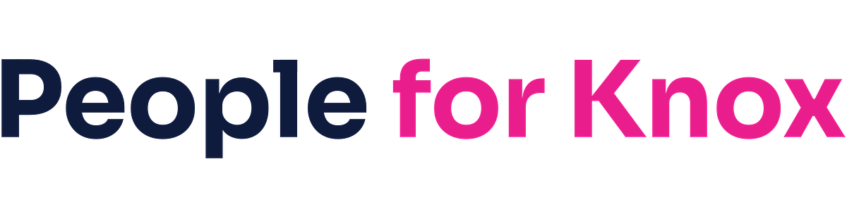
Here are a few simple rules keep the look and feel of the People for Knox campaign consistent.
Logos
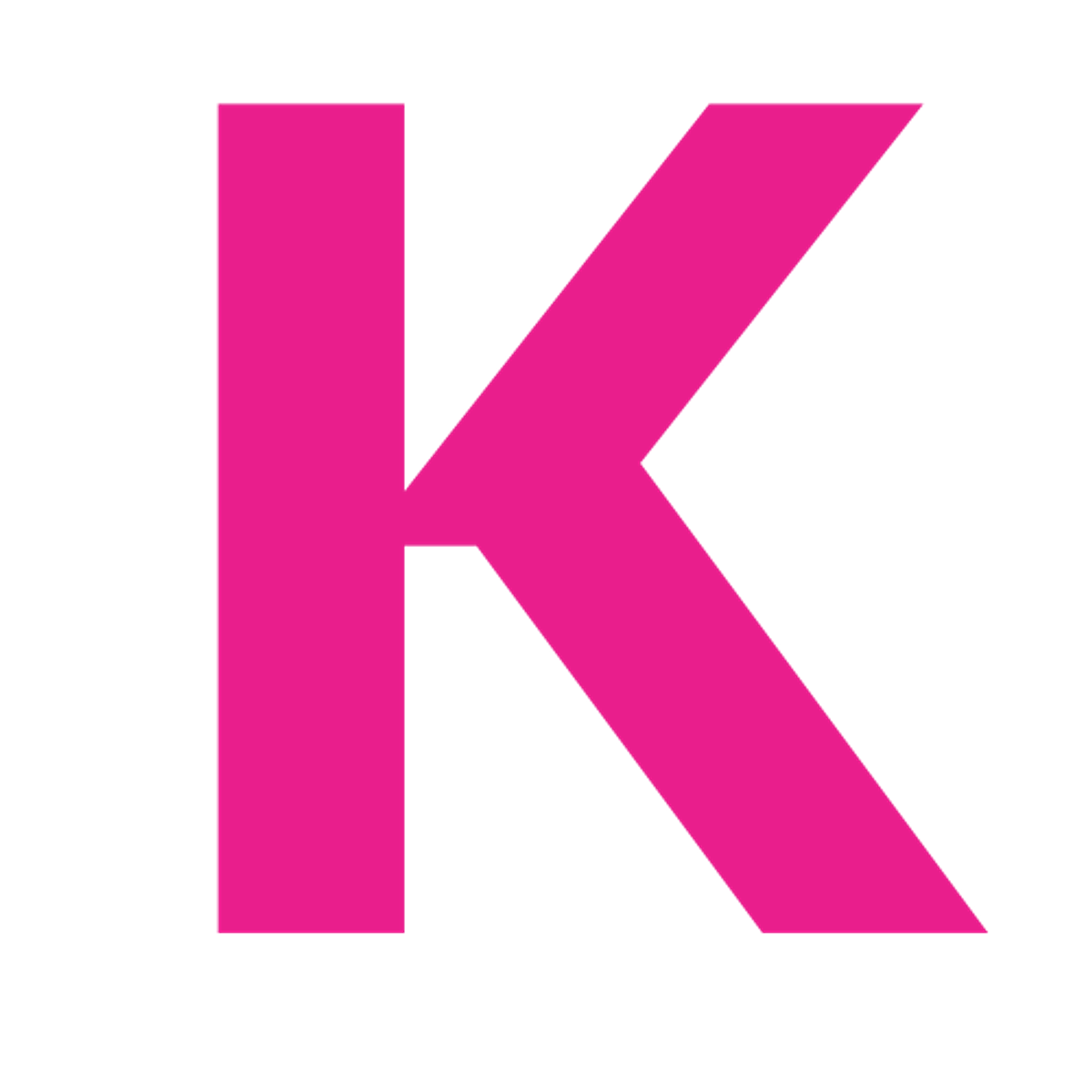
Do
- Use the full lockup whenever space allows
- Use the icon for tight spaces — social avatars, favicons, buttons
- Use the light versions on dark backgrounds or photography
- Leave clear space around the logo equal to the height of the "K"
Don't
- Recolor, outline, or apply effects (shadows, gradients, glow)
- Stretch, rotate, or distort the proportions
- Place the color logo on a busy or low-contrast background
- Recreate the lockup with a different typeface
Colors
Lead with Primary #4361EE. Pair it with Secondary #0F1B3D for body copy, navigation, and grounding elements. Save Accent #F72585 for highlights and calls to action. Never use accent for body copy or large fields.
Click any swatch above to copy the hex code.
Typography
- Sora: headlines, body, captions, everything by default
- Caveat: handwritten accents, pull quotes, signatures (use sparingly)
- JetBrains Mono: code, data, and technical contexts only
All three are free on Google Fonts.
Need something else?
For a custom asset, a print-ready file, or a question about appropriate use, email [email protected] and we'll get back to you within a couple of business days.